Marketing Buddy

Project Overview 🔍
Internal Digital Transformation and Automation
The internal marketing platform has not been updated since it started running in late 2014 . With a lot more new developments, functions and features on the roadmap for the e-commerce platform, it's about time to re-align everything and find a sustainable design solution.
Comparison
The previous internal marketing platform used required repetitive labour, was laggy, and has a steep learning curve due to the absence of documentation and non-intuitive patterns and naming conventions.
The lack of planning and a design system has hindered the platform's ability to scale and grow to fit the marketer's needs, as they now need to manage more new initiatives and campaigns in the same amount of time.
a comparison between one of the features, redesigned.
Our Goals
01
Address inefficiencies:
General issues like responsiveness, organisation of data, hierarchy and information architecture
02
Boost productivity:
Add automations and grouping functions to avoid users having to do repetitive labour
03
Lessen learning curve:
Be consistent with intuitive controls for newcomers to pick up easily
04
Be ready for future features:
Be sustainable with reusable and flexible components
Challenges/Constraints
01
Strive for minimal changes to backend:
Data structure change requests to the backend database systems were much harder to negotiate for due to the scope and limited resources for this project
02
Tracking down "history":
There wasn't much documentation and records available
03
Balancing UX, technical feasibility/limitations
Impact⚡️
01
02
03
04
The Process ✏️
Exploring user pain-points & finding opportunities
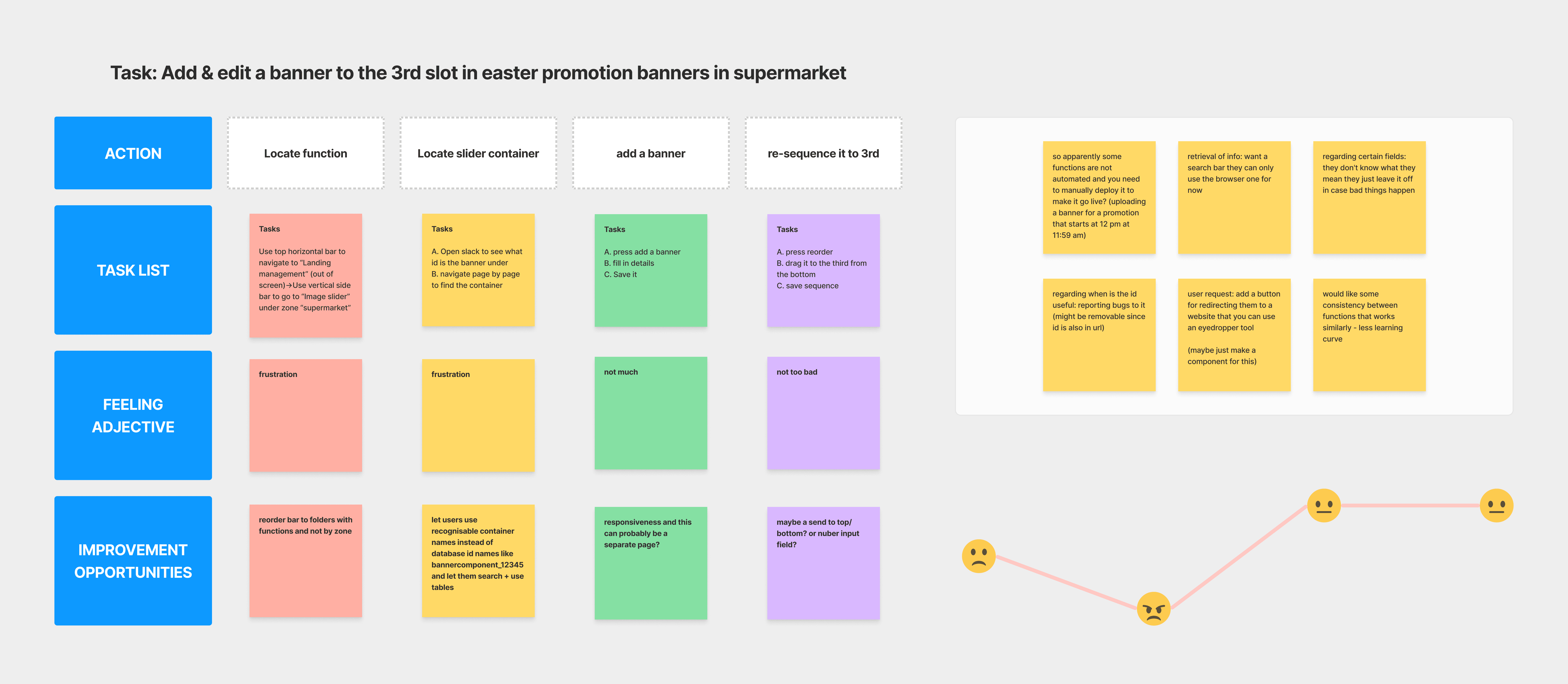
Initial briefs from product managers gave us a basic overview of the system, but we needed more depth. To identify improvement opportunities, I engaged with users and tested the system, conducting an audit and observing workflows to pinpoint inefficiencies. This direct feedback helped guide informed decisions on feature implementation and prioritize critical functionalities for smoother integration.
Trying it out
I conducted an audit based on my first experience of the product and made notes for general improvements .


I did this for most of the features, but here's 2 illustrating issues that they all share
Understanding Workflows and User Interactions
I met with users multiple times to gather insights and observe their workflows. I also engaged with users to see how the system functions in real-world scenarios, asking targeted questions to identify inefficiencies and uncover improvement opportunities.
Technical Limitations and Feature Prioritization
By analyzing user needs, we guided stakeholders in making informed decisions about feature implementation, assessing them based on usage frequency, urgency, and demand.
We considered how phased deployments would impact user flow, prioritizing critical functionalities for smoother feature integration and a user-centric, technically sound product.

Final Designs 🧑🏻💻
Shaping changes
A few rounds of designs later after bouncing between engineers and users to gather feedback on the new marketing hub allowed us to iteratively refine its design and functionality. This process ensured intuitive controls, streamlined workflows, and enhanced housekeeping features. After that, we migrated the marketing tool to a more responsive hub in phases.
Creating a Sustainable Design System
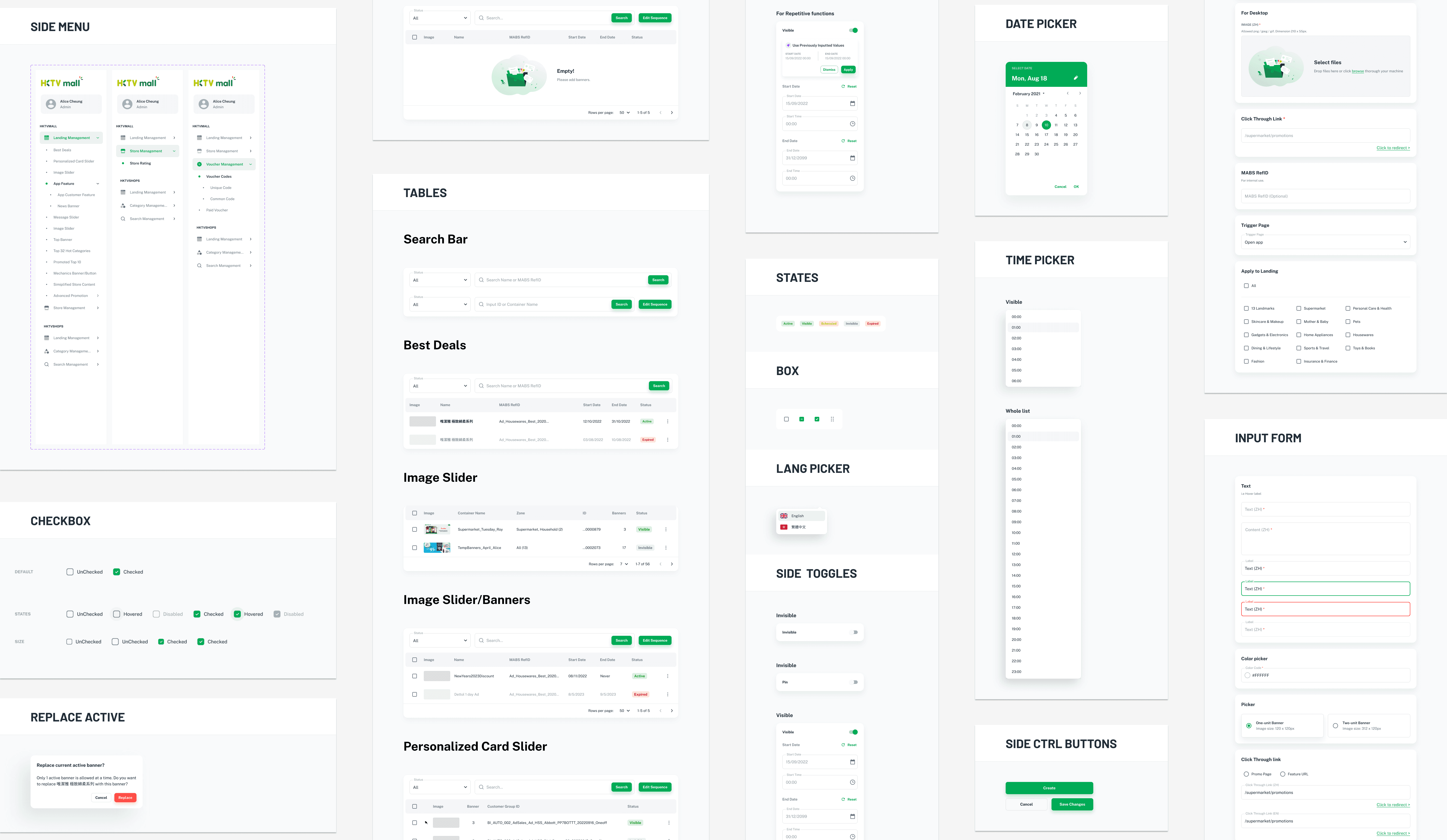
We introduced a design system to replace the previous approach of stacking random elements without a cohesive design. This new system streamlines workflows, enhances productivity, and provides an intuitive user experience.
Modular parts enable teams to efficiently execute changes, as our phased approach requires scalability and has to be easily reusable.
Streamlining processes
Cutting out the middleman
Integrating frequently used functions that require a third-party website or process to complete task into the redesign.
A simple one would be the eyedropper and a more advanced example, would be hooking up the database system and adding visual interfaces to skip steps such having to use SQL and excel files.

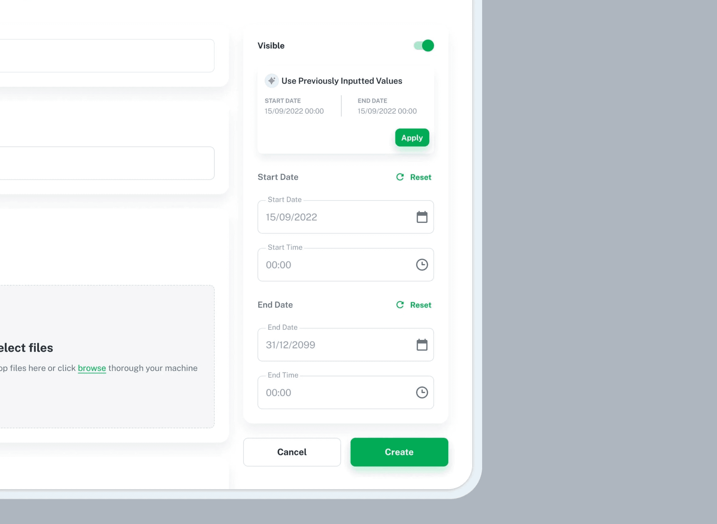
Adding scheduling
Less manual labour
Before this update, users were required to sign in and personally launch campaign materials at designated times.
Now, campaigns can go live accordingly. The newly embedded automation and classification functions also help users in avoiding repetitive form inputting tasks.
Compatibility with older systems/practices
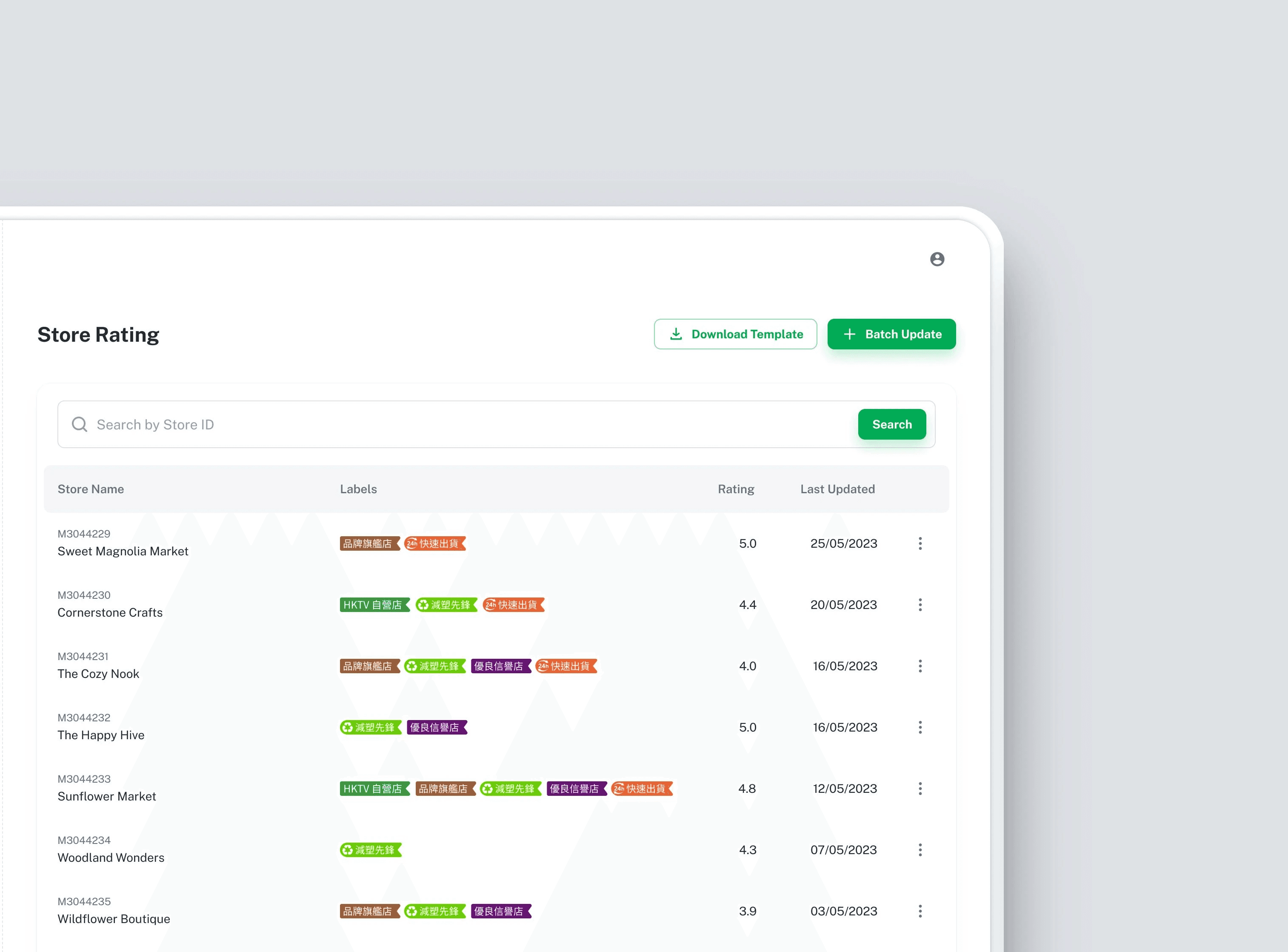
Adding a visual interface
Before the redesign, there was only one way to make changes in certain functions, and it was through uploading an excel sheet in specific templates. Now a GUI for updating is available.
This allows the flexibility of being able to perform individual updates and provides feedback from system to confirm that changes made were successful. This makes the tool more accessible and visually engaging.

Overview tables
Facilitating info retrieval and housekeeping
The overview tables are now consistent in each page, users can rename campaigns instead of using system IDs and also review and remove expired and redundant entries in a glance.
For example, 'Banner_00288837' can be changed to '2024 New Year's Campaign,' enhancing data retrieval and monitoring of campaign statuses. Load times were also reduced as housekeeping features were implemented.

Final look
Impact⚡️
01
02
03
04
Takeaways 🥡
Never underestimate a good ol' refresh
It's easy to always remember to put customers first in any business, but besides growing customer bases and teams, never forget the tools too. While scaling up, review tech stacks and everyday tools. Good tools saves money on operations and help free up time for great minds to cook up great things, ensuring all teams work efficiently toward business goals. 🧠

